Products
Cooperation
Support
About Us

Recent Searches
Clear
Popular Products
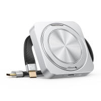
20Gbps Magnetic Portable SSD with Foldable Stand
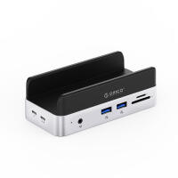
MiniDock Stand Dock with Storage for Mac mini M4
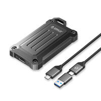
20Gbps Rugged PSSD for Outdoor Use